AT&T deal will make every phone a satellite phoneIts partner, AST SpaceMobile, will launch its first five commercial satellites this summer.By M. Moon, a day ago
A group of TikTok creators are also suing the US government to stop a ban of the appBy K. Bell, 05.15.2024
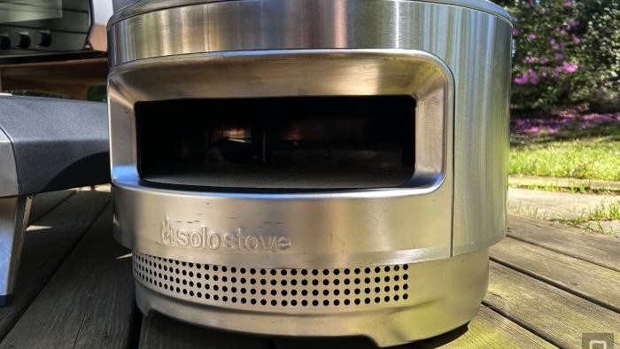
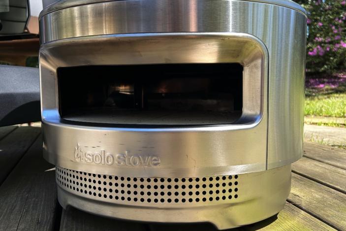
Solo Stove Memorial Day sales cut up to $280 off Pi Ultimate pizza oven bundlesBy K. Holt, 17 hours ago
The 20 best PC games you can play right now for 2024Where to start with a juggernaut like PC gaming?By Engadget, an hour ago
OpenAI strikes deal to put Reddit posts in ChatGPTThe deal is similar to the one that Reddit struck with Google just months ago. By P. Dixit, 9 hours ago
Grand Theft Auto 6 will arrive in fall 2025Take-Two narrowed the game’s release window in its latest earnings report.By W. Shanklin, 11 hours ago
US House passes TICKET Act to force event pricing transparencyBut it doesn’t appear to address exorbitant fees or bots.By W. Shanklin, 11 hours ago
HBO’s upcoming MoviePass documentary is a must-watch for fans of tech trainwrecksThe film premieres on May 29. By L. Bonk, 13 hours ago
What to expect from Microsoft Build 2024: The Surface event, Windows 11 and AIAre you ready to worship at the altar of Copilot?By S. Rutherford, D. Hardawar, 13 hours ago
Sony’s new smartphone could entice shutterbugs away from Apple and GoogleThe Xperia 1 VI comes with a telephoto camera, AI autofocus features and a unified photography app.By L. Bonk, 14 hours ago
EA Sports' dormant College Football will reemerge, cicada-like, on July 19Madden NFL 25 will arrive less than a month later, on August 16.By K. Holt, 14 hours ago
YouTube reportedly agrees to block videos of Hong Kong’s protest song inside the regionAn appeals court ordered the ban, citing national security issues.By W. Shanklin, 14 hours ago
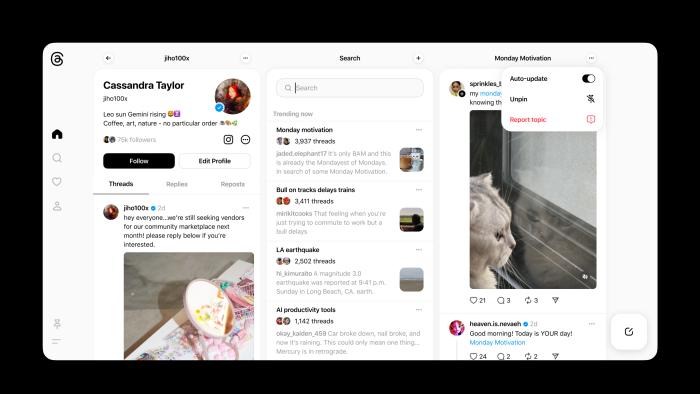
Meta's Threads gets its own Tweetdeck cloneYou can set automatically-updating pinned columns to track specific searches, topics and accounts. By K. Bell, 14 hours ago
Activision forms a studio to develop a brand-spanking new IPCall of Duty? What’s a Call of Duty?By L. Bonk, 15 hours ago
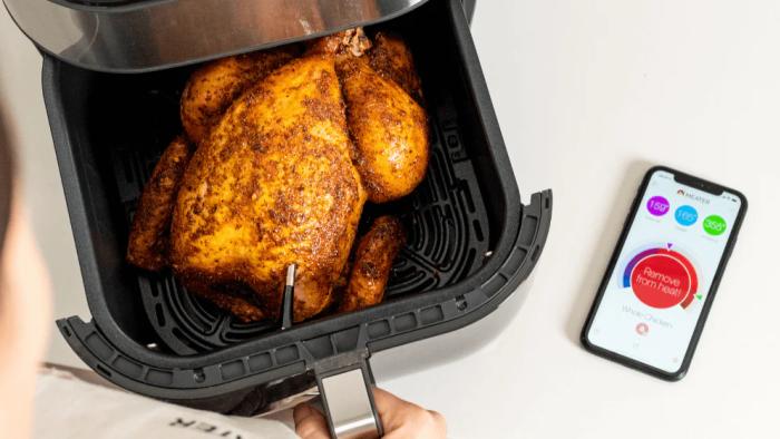
The Meater Plus smart meat thermometer drops to a record-low priceTake the guesswork out of outdoor cooking for $70.By K. Holt, 15 hours ago
Google’s accessibility app Lookout can use your phone’s camera to find and recognize objectsIt's also making wheelchair information on Google Maps available on desktop.By M. Moon, 16 hours ago
8Bitdo's Ultimate Controller with charging dock is back on sale for $56That's 20 percent off and close to a record low.By L. Bonk, 17 hours ago
Solo Stove Memorial Day sales cut up to $280 off Pi Ultimate pizza oven bundlesYou can pick up a bundle with a wood-burning oven for $480.By K. Holt, 17 hours ago
Samsung's Music Frame gets its first discount on AmazonThe speaker debuted last month and is now $25 off.By S. Fielding, 18 hours ago
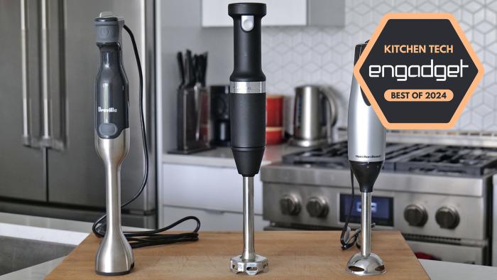
The best immersion blenders for 2024For when you don’t have the space or the dough to buy a countertop model. By S. Rutherford, 19 hours ago
Netflix is becoming an ad-tech companyThe streamer is bringing its development in-house. By S. Fielding, 19 hours ago
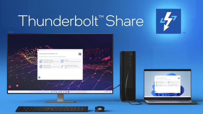
Intel's Thunderbolt Share makes it easier to move large files between PCsIt also enables sharing screens in Full HD.By M. Moon, 19 hours ago
EU investigating Meta over addiction and safety concerns for minorsThe European Commission's proceedings will look into whether Meta has violated the Digital Services Act.By S. Fielding, 20 hours ago